Tuesday, December 14, 2010
DRAGONS!?
So we were assigned to create a person or animal walking. I decided that I wanted to try to animate a dragon flying. I had to look up how a bird flies, which took longer than I thought. It was really interesting to see how an animator draws things step by step. I really enjoyed this project. I may just have to try doing this with a Disney character to see how that would work out....
Overall, I think this turned out really well. The Pirates of the Carribean music matched incredibly well. GO KLAUS BADELT! (It's He's a Pirate by Klaus Badelt.) I think it was very sucessful as my first hand-drawn animation project. I love this type of thing!!!
Hand-drawing this is what worked out incredibly well for this project. I hoestly don't think it would'vr turned outa s well if I'd drawn this on the computer. The only thing that didn't work as well was editing the music, but that was because I'd never done editing on audacity before so... idk....
If I do this again, I'm going to try using Disney character. But that's just because I'm obsessed. Hahaha! I would also try to remember to put the sun behind the clouds...
The most difficult part to my was making sure everything went as fast as the dragon was flying and making sure that it was also going the same direction as him so that it doesn't look like he's going backward- which would completely defeat the purpose of him flying.
I learned how to draw movement with characters which was SO COOL!!! :)
Tuesday, December 7, 2010
College Fair!!!

We were assaigned to create a logo for the upcoming college fair! We were given free reign of the project as long as there were no more than 2 colors used and that it could go into only grayscale and still look good.
Thursday, December 2, 2010
Disney Design 5

This is my least fave. I didn't like putting the texture infront so it's not very good.
I would turn the opacity waayyyyy down next time.
Disney Design 4

This was the first one I did. I wasn't entirely sure what I was doing with this one so next tim, Ima be planning this out. haha!
I would change the texture in the background to black mickey heads rather than pink.
Disney Design 3

This one is another one of my faves. It turned out really well. I had probs with this one mainly bc i was running out of ideas. haha!
i learned that it's ok to put some layers over others bc they look better than if they remain behind my original thoughts/intensions.
Disney Design 2

This one is the best out of all of them. What worked the best was the style of font I chose and then accented by each aspect of the mandatory designs.
If I had to redo this, I would make the Mickey heads of my texture black rather than hot pink.... not a big fan of that one....
Disney Design 1

This one was the most fun to do because I drew each character and then uploaded it onto photoshop. Then I added color. This one turned ok overall bc I wasn't sure how to add all of my elements and make it look good.
I think the actual doodle was sucessful, but this design overall is just ok.
Monday, November 22, 2010
Grooveshark.com

So we had to make a play on words. I made mine for the free music website grooveshark. woot.
Wednesday, November 17, 2010
Airplanes Face Video
Mr. Sands told us to make a mini music vid using the same techniques as our talking mouths vids. I really like this mini vid, it took forEVER to do (2 weeks). I like the graphics I got to do at the end, but that may be because I was happy I finally finished... I dunno. I think this was a semi-sucessful project, buuuut if the viewer has epilipsy they may wanna be careful because this may cause seizures. I had to redo one of my pics (one of the major ones too) and it causes a weird flashing sensation that takes away from the overall awesomeness of the vid. My mouth sizes that I drew worked really well in my opinion. It relatively matched my face, which was nice. Again, the redo pic didn't work as well as I'd've hoped. Next time, I will make sure I save all of my pics before deleting them. That way all of my pics will match... The hardest part was being able to focus on the project for a while. After the first week, my attention span plummeted and it made my project take even longer. I learned to constantly save because if I'd lost any of my work, I would've cried.
Monday, November 1, 2010
The Rum Went Away
I was assigned to make this video using the common mouth pictues to create the illusion that my 'mouth' is moving to the words in the sound file. I really liked this project, but I didn't do the pictures right. I tried not moving, but I still did so the picture 'jumps' a lot, which is a little motion-sicknessy.
I plan on doing this again, but I'm going to put in a new background bc i think that's what's 'moving' to make the background jump.
Any tips for my next attempt would be nice! :D
Friday, October 22, 2010
Thursday, October 21, 2010
DC Trip Poster

We were assaigned to make a poster for the Art History Class advertising their trip to DC to tour many art hotspots. Here's how mine turned out.
Wednesday, October 13, 2010
Superheroes - Mainly Marvel

I got bored in comp. art because I finished my project early. Soooo as a comic book fan I decided to make a collage of lots of heroes. Maybe I'll do villans next. I dunno... ENJOI!
Tuesday, October 12, 2010
SUPERMAN!!!!

This was a random project I decided to do. I really like Superman and today for Nerd Day I wore my Marvel Superheroes shirt. Decided I might as well go for a theme today. XD
Mike would like me to specify that Superman is not Marvel, but rather DC. I know the difference, but he's being picky. Marvel > DC


Happy Holidays!

We were assigned to make a holiday greeting card for Fall so I made one for Thaknsgiving! I hope you like it! There are a total of 3 because I can't decide which one is better.
Thursday, October 7, 2010
S is for Shadow

Our Friday assignment was to create a letter using something that had that letter as its first letter. Wow... too many letters in the sentence. Anyway, I decided to use "S" for "shadow" (obviously). It wasn't too hard, I used mainly liquify and the clone tool so it took a while but it wasn't too bad.
I'd wanna try another object (preferably an animal) next time and try some new tools out on it.
Wednesday, October 6, 2010
Snake o de Earth

We were assigned to make an animal into something it represented. I thought that a snake (since it's stuck on the ground all the time) could represent the precious stones and metals that are from our Earth's crust. I used the clone tool to make scales of emeralds and sulfur. I also used diamond to make the tongue and rubies for the eyes. Amethyst was used for the pupil and the nostrils. The only non-metallic earth thing I used was ivory which became the fangs.
If I did this prject again I would try another animal and use objects like rakes or common items like that.
I like my snake. I think he turned out well. Yes, it's a he. XD
Monday, September 20, 2010

Friday, September 17, 2010

After Re-touching

We did a tutorial on how photo-editors of magazing touch up celebrities and make them look 'perfect'. It makes me extremely mad at Hollywood at the moment, oh well. We got a normal untouched picture of a girl (Mr. Sands had it and I have no clue where he got it so...). We copied the layer of her and used tools such as hue/saturation, liquify, and Spot Healing Brush Tool. The latter took away any blemish/'unwanted' freckle.
This was a great project and I really enjoyed learning about how extremem most touch-ups are. Next time, I would give her green eyes (rather than purple) and try another way to redo her make-up.
Wednesday, September 15, 2010

Fire Elemental Paint Splat

This was an extrememly hard project (mainly because of how precise all my erasing/cutting had to be). We were assaigned to create a flowing, matching paint splat picture using pictures that we took and non-copyrighted images if needed. I attempted to create an elemental-genre picture (like the person was controling the flames).
I like this one because it turned out the best, but I'm also putting my water one up as well. You can decide which you prefer.
I I did this project differently, I would arrange the paint splats in a different way or would use different ones altogether. I like the colors I used in this one and my water one though...
Monday, September 13, 2010
Amplified

We were assigned to practice bevel and emboss and make an amp. I don't like this amp and it really doesn't look real. I couldn't figure out the whole color thing. Next time, I'm using black...
Friday, September 10, 2010
CoLoR wHeEl

We were assaigned to create an original color wheel using things that represented us. I used seahorses and surfboards because my life practically revolves around the beach. Plus, I love to surf.
First I found the right images, made about 25 layers or so and then made another layer overtop of each one so that I could insert the colors and make them flow. This took about three days to do. It turned out really cool!
I think if I did this project again, I'd choose something other than seahorses for the center or attempt a background.
I really like how the surfboards took in the color. I think they're my favorite part of the color wheel.
Thursday, September 2, 2010
Escaping Reality
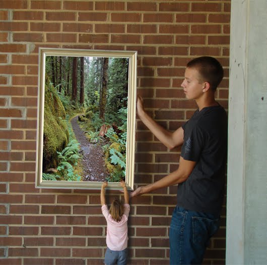
We were assigned to take pictures of ourselves with a partner and a picture frame and then adding something in the picture that showed something about us. (wow... that was a run-on)
After taking the pictures in the school courtyard, my partner and I brought back the camera and uploaded our pictures to the computer. After ward we were allowed to go crazy with the details. I wanted to make it look like I was trying to escape into the picture for a while (inspired by the Voyage of the Dawn Treader by CS Lewis).
I layered the original picture (the one with my partner and the frame), cut myself out of my 'falling' picture, and then found another picture of a place I would rather be and inserted it.
If I did this project again, I would try having the frame sideways because there were a few beach scenes I wanted to use but couldn't because they were horizontal.
One thing I had trouble with was adjusting the picture inside the frame. I'm going to make sure my frame is straight next time so I can adjust it better.
Tuesday, August 31, 2010

HORSEFLY!

Two days ago, we (the class) we assigned to make a newimal. A new animal. Haha. ':/
I decided to make a 'horse fly', a combo of a horse (obviously) and a butterfly. Using tools such as eraser, magic wand, etc... I added a background and faded the horse/wings to match the background and 'fade in'.
I really like this one, I feeel like I did better than the frog picture (ugh). It looks cool and I really like its wings.
If I do this again, I would like to try morphing a human with something. Maybe make a fairy or mermaid...?
Friday, August 27, 2010
Just for kicks and giggles

Because we learned this and I had some time after I made this blog... This isn't an actual project we had to do.
FROG!!!!

Yesterday we learned about stuff like the burn tool and the clone tool on photoshop. We used them to combine a woman's face (I hope that's a woman) and a frog. You made her tongue look like a frog was emerging from her tongue and going to crawl up her face.
I think it turned out meh... Yes. Meh. I don't think it looks realistic enough to be good. I need to work on shadows and figure out that stupid clone tool. I don't like it.
I would definitely add the tattoo I wanted on it, but I didn't have the time to do so... :/ I would definitely take more time on it in general.
Biting Pancakes

This was created as my first assignment in my Computer Art and Animation class at school. COOLEST CLASS EVER!!!!!
Basically you're using Adobe Photoshop CS4 the whole time so if you ever wish to try... :D Good luck!
What we were supposed to do was find a normal picture of pancakes and warp it to look like it would bite you back if you tried to eat it.
We found the picture and then uploaded it to photoshop. Then took the smudge tool and stretched it to around the size of a mouth. Taking the mouth of a snakehead, we inserted it into the space and then used the eraser tool (on a low opacity) to allow the color to blend and look a little more natural. Then we smudged again to cause it to look more realistic and then changed the color slightly with another tool that I don't know what it was... Sorry!
We were allowed to add our own touches so I added eyes. Turn it into a jpeg and VIOLA! This picture. I am highly amused by this picture. It looks like a mix of cookie monster and a pirhana...
If I did this one again, I'd redo the eyes. Or at least the eye on the left, I didn't have as much time on that one because the bell was about to ring and I had to finish it up quickly.
I feel like I've written a novel sooo.... Adios!
Subscribe to:
Comments (Atom)